ShopDreamUp AI ArtDreamUp
Deviation Actions


Suggested Deviants


Suggested Collections


You Might Like…


Description
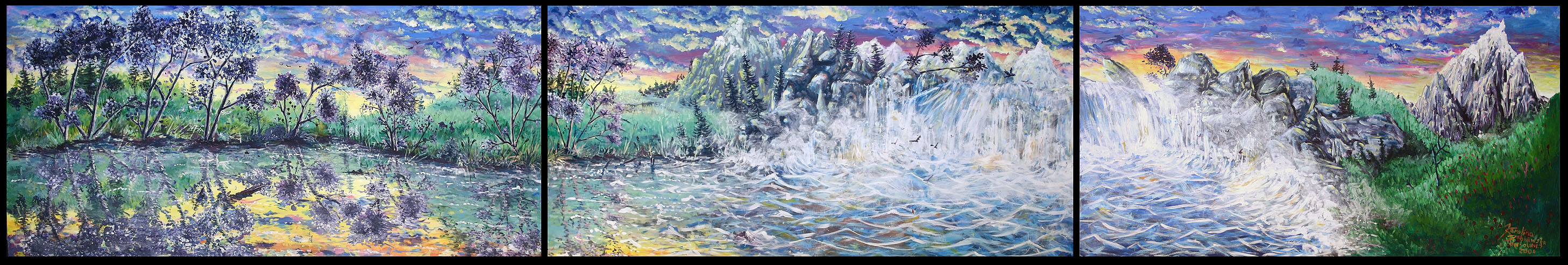
Mural for Ross Memorial Hospital in Lindsay, Ontario, Canada. (For the last time,) it goes in the heart rehabilitation room that has piss yellow walls and no windows (and bloody pink everywhere else).
Mrs. Tate-Sears from the Gallery estimated this is easily worth $3000, but I did it for nothing.(I'm not bragging, just answering the FAQ.) I really did do it for the sick people there. I don't want them to look at exhausting crap that'll just make it worse for them. This is meant to make them happy and calm inside, so they're blood pressure doesn't go through the roof, or they don't feel like giving up. It is also meant to be very ...irrelevant to reality so that it does not remind them of anything that might be severely upsetting. I put a lot of hidden things in it to keep them interested. They have different levels of difficulty to find, hardest being the moose and the 5th galloping horse. (John's still the only one to find the moose quickly, and without my help.)
This is on and off in 80 minute periods for about 10 months, which is roughly 400 hours, plus or minus of course. (I actually really enjoy working this way.) Random fact: According to the calculator, this means I'd be paid $7.5 an hour to do this. Pretty shitty pay.
I apparently experienced a severe learning curve while doing this painting, which is most important to me. My original art teacher noticed how it took me months to do the first panel, while I did the last in a couple days. (That kind of pisses you off when you realize how much extra time you wasted.) It isn't because I did a sloppy job on it, or it was easier, I just learned how to process imagery quicker in my brain while using acrylic paint.
It's acrylic paint, which is where the weird, radiant colour comes from. I kind of don't like how domineering the blue colour is. I really hate blue, mostly because it's overrated, corporate-like, cold, and literally burns my eyes. I guess the obscene colours fit today's culture.
I was asked if this relates at all to my own country. After looking at pictures of Polish fields, I can pick out many similarities that happened unconsciously, like the random pine/cedar trees, and the red flowers. There are also pretty nice mountains in Poland, and lots and lots of grassy fields. It's important to put important things to yourself in your work, it's much better than a written signature.
It's supposed to be separated like that, because 1) the wall it goes on has pillar things separating it, and 2) the edges unfortunately don't exactly line up nicely. These are also separate paintings in themselves, so I think that also needs to be distinguished.
Preps and things: [link] , [link]
Seperate panels: [link] , [link] , [link]
Copyright © Karolina Wilka Szablewska - 2006
Image size
2915x492px 605.17 KB
Make
Canon
Model
Canon EOS DIGITAL REBEL
Shutter Speed
1/20 second
Aperture
F/4.5
Focal Length
27 mm
ISO Speed
100
Date Taken
Jun 12, 2006, 2:08:10 PM
© 2006 - 2024 moltres
Comments14
Join the community to add your comment. Already a deviant? Log In
Bless You,for your kindness,and making the world a more beautiful place